
Relocating the Chart's Legend
Excel automatically adds a legend to your charts to help your readers interpret the data.
You can adjust the position of your legend following the instructions in the accompanying video, to satisfy your own stylistic preferences. You can also choose to take the legend off your chart completely.
Setting the location of the legend on the chart
Let’s have a look at the following chart:
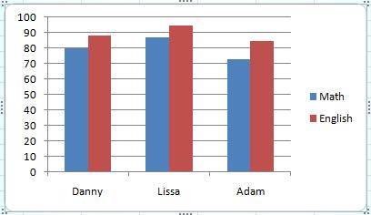
At the right hand side of the chart, you can find the legend which gives you information about the meaning of the chart’s colors: Blue means Math, and red means English.
You can change the legend’s location on the chart by following these steps:
- Select the chart by clicking it.
- Choose the “Layout” tab on the ribbon.
- Click the “Legend” button. A menu like this will appear:
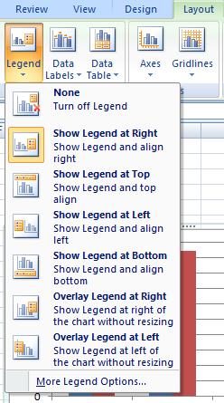
- Choose the legend location from the different options appearing on the menu.
You can also hide the legend by choosing the first option on the menu (“None”).
When and why is the legend useful?
Often it is helpful for readers to have a legend on the chart, but sometimes it is completely unnecessary and merely clutters the space.
The chart in the accompanying video has two columns for each name and would be hard to interpret without a legend. If there was only Math for example, you would be able to entitle the chart “Exam grades in Math” and remove the legend.
Don’t go crazy trying to perfectly adjust the position of your legend. Most of the time legend positioning is merely a design choice. A legend’s place will rarely affect your chart’s functionality, but on the odd occasion when it does it is helpful to know about this option and be able to apply the appropriate corrections.